Hallmark is a world-renowned company, and its impact has spread far beyond the greeting card that started its journey. As a Designer on the Corporate, Employee Experience, and Global Solutions Team, I developed, created, and executed designs and concepts related to the strategic support of varied business channels. A large part of this work related to employee experience, and we strived to create a sense of belonging within the company to retain valuable employees. This included events both in-person and virtually and initiatives for a variety of our partners to raise awareness of benefits and new business developments. I also supported many business development opportunities, such as visits with retail partners from around the globe, trade shows, and other key sales opportunities.
Displayed on this page are some of my favorite projects, but for a more comprehensive view of my work at Hallmark, please use the buttons below.
Displayed on this page are some of my favorite projects, but for a more comprehensive view of my work at Hallmark, please use the buttons below.
|
|
Global Solutions SummitI had the pleasure of working on an exciting project to create and implement a new brand for the Global Solutions Summit. As part of the Corporate team, I was tasked with giving the event a fresh and polished look, as it had not been held in person since 2017.
To start, I designed a dynamic word mark that featured bold color bars, strategically chosen to stand out against the signature Hallmark purple. I incorporated these eye-catching pops of color throughout the event to ensure easy recognition of signage for guests. The event was a tremendous success, with 40 retailers from 26 different countries attending at Hallmark Headquarters in Kansas City. It was a fantastic opportunity to showcase my skills and contribute to the success of such an important event. |
ONE Legal SummitThe Enterprise-wide Legal team at Hallmark recently gathered for a summit, marking their first in-person event since 2019. I was entrusted with the responsibility of creating a word mark for the event that tied into their existing branding, and also devising tactics to be implemented throughout the summit.
One of the major challenges of this project was to create a word mark and lock up that featured several enterprise logos, which had to be incorporated into various tactics, including an acrylic coaster. It was an exciting challenge that demanded creative problem-solving skills. To ensure that the logo appeared sharp and precise on all applications, I collaborated closely with another designer on the team and our prototype studio. |
|
|
|
Walgreens golf classicFor this project, I was tasked with rebranding an existing event in partnership with a Senior Designer. Together, we developed a new logo lockup featuring a crest that showcased a golf ball sitting on a tee. This crest was incorporated into the event's centerpieces, which were die-cut and placed in grass arrangements. We also used this crest on swag given to attendees, including can coozies. To ensure consistency year-over-year, we created a simplified version of the logo lockup for future use.
Additionally, I created new patterns for the event. The previous versions had used plaid patterns, so I aimed to create something fresh and modern. To accomplish this, I utilized the modern block pattern, paired with stripe and windowpane patterns to maintain the preppy feel the event was going for. Overall, this was a successful rebranding project that effectively distinguished the event from its previous iterations. |
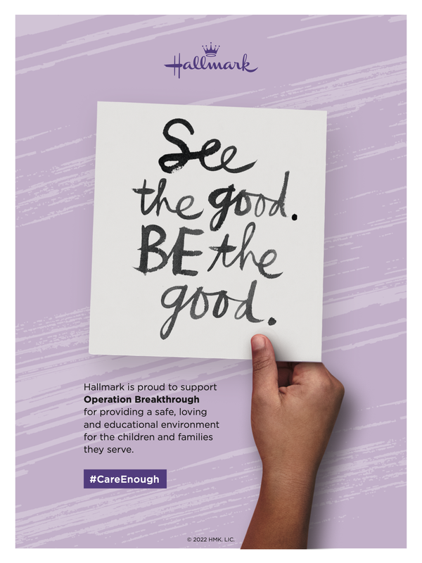
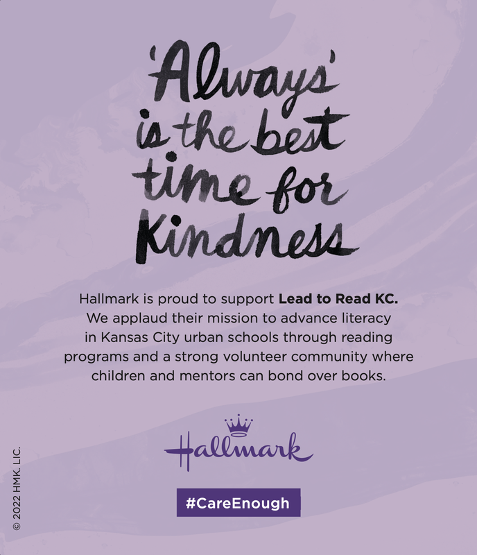
Program AdsAs a designer on the Corporate, Employee Experience, and Global Solutions team at Hallmark, I had the opportunity to work on a variety of projects, including creating ads for Hallmark's sponsored charities. I collaborated with the team to execute the ads, working within an existing style guide to ensure consistency across all materials. This included creating ads in a variety of sizes and specifications for both print and digital needs. I ran preproduction checks to ensure proper file setup and accuracy before submitting final files to our partners. Through this work, I was able to contribute to Hallmark's commitment to supporting important causes and making a positive impact in the community.
|
|
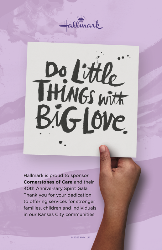

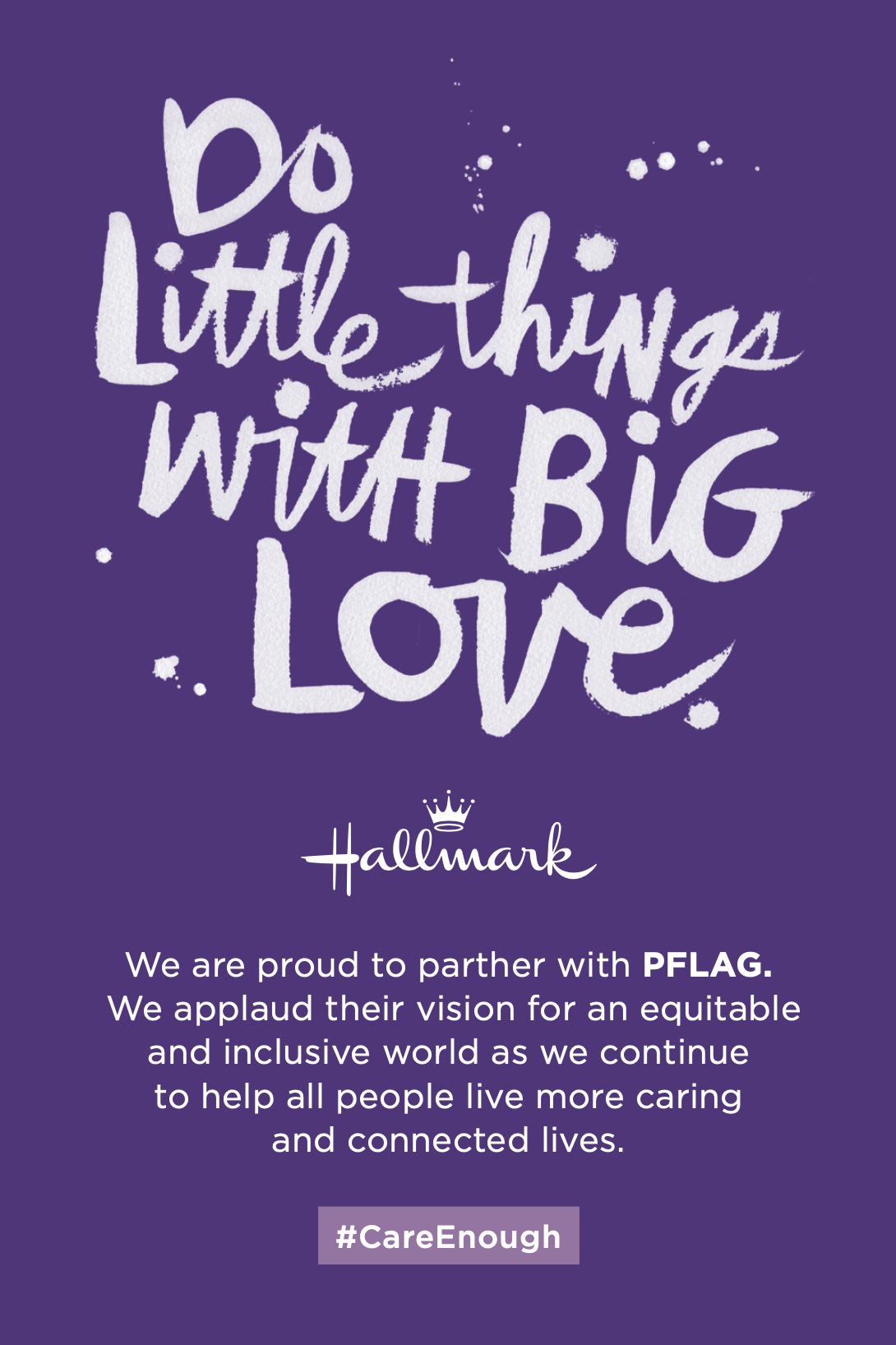
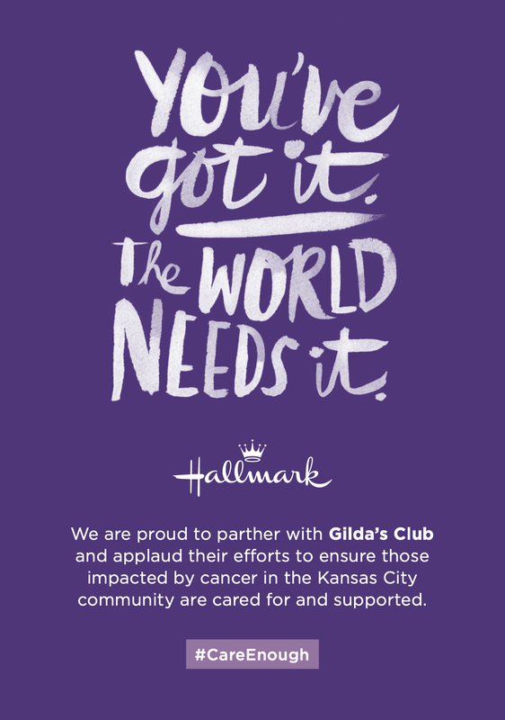
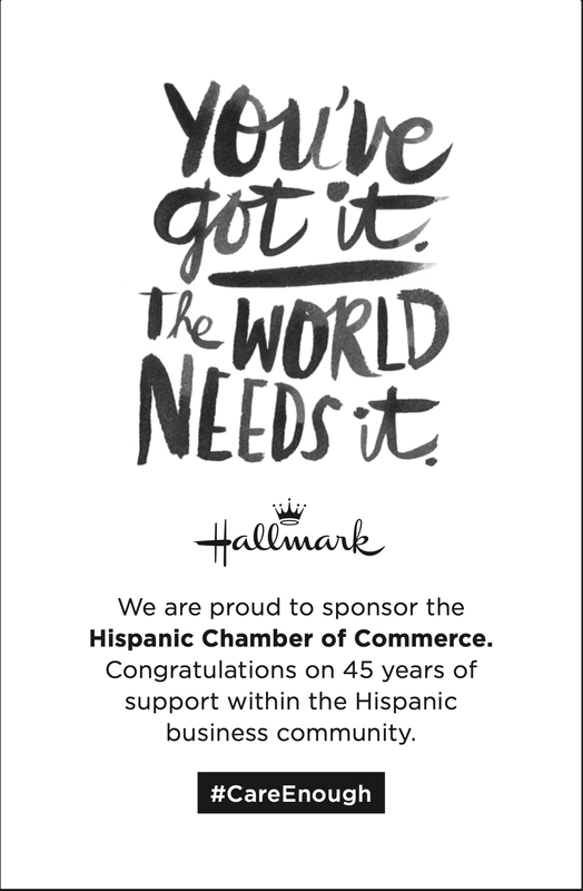
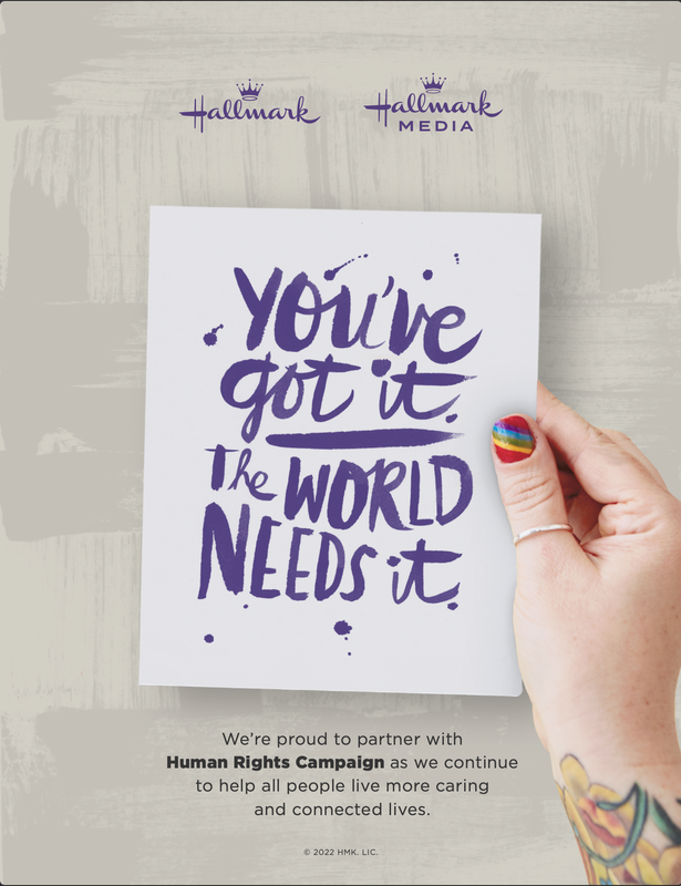
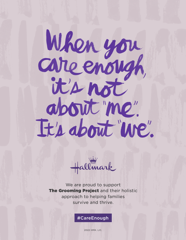
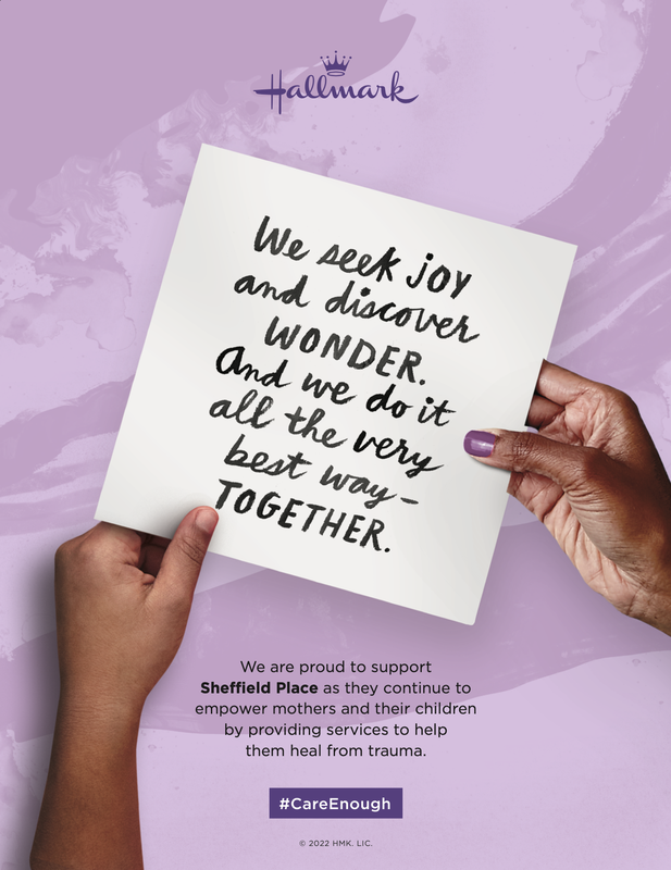
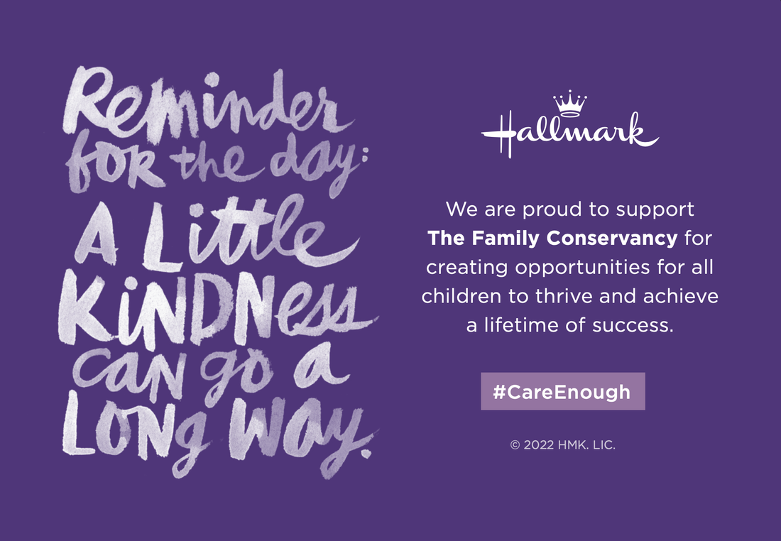

|
|
New Hire RoomsThese boards were created to be displayed in the New Hire Orientation Rooms at Hallmark's HQ. These rooms needed a refresh after going without use for several years.
The design follows an existing style guide, and features a concise version of the corporate beliefs and values to integrate the new hires into the company and get them excited about their new position. The photo op is off to the side of the room, and features the Hallmark logo at the top to be seen in the pictures, as well as several options for hand-held props. These also feature the logo so that even those new hires that are more shy will still be sharing a branded photo. |
ICON 11 SponsorFor ICON: The Illustration Conference, I took on the task of creating a cohesive and recognizable look throughout the event by manipulating existing illustrations created by Hallmark artists. Using these illustrations, I created the fabric backdrop displayed behind the sponsor table, which served as a jumping-off point for other tactics. One such tactic was a flyer that was handed out to illustrators as a recruitment tool to acquire new talent during the conference.
In addition, Hallmark sponsored the closing party, which was intended to be a fun end to a creative few days. To add to the creative atmosphere, we provided stations at high-top tables with paper and Crayola products for drawing. We also added hang tags from the acrylic displays featuring inspirational quotes lettered by Hallmark artists. |
|
|
|
HOW ConferenceAs part of the Hallmark team, I designed the fabric backdrop for the Hallmark speakers at the How Conference, an event for entrepreneurs to learn new business practices and share ideas. The backdrop featured the #my5days program, which gives members of the Hallmark creative community five extra days off per year to explore their creativity.
To ensure the backdrop was on-brand, I worked within the existing #my5days brand system and created a design that visually communicated the message of the #my5days program as a key pillar of the creative community within Hallmark. My contribution helped showcase the program and its benefits to the attendees and potential customers. |
Supply Chain weekIn an effort to foster a stronger sense of belonging among supply chain employees, Hallmark organized a Supply Chain Week across all their global locations. This week-long event featured various activities and intranet highlights showcasing the employees' achievements.
As part of the team supporting this initiative, we developed the new Supply Chain branding and executed its rollout during this exciting week. I assisted the lead designer, by creating a range of tactics for the event, including designing the caring challenge display and cards, as well as devising props for the photo booth. Our collective efforts succeeded in elevating the Supply Chain Week experience for the employees, promoting a stronger sense of community and purpose within the supply chain department. |
|
|
|
Recruiting TacticsRecruitment was a crucial aspect of our work at Hallmark, as it was essential to attract top talent across all of our divisions. To achieve this, we actively participated in career fairs and other recruiting events, where we sent representatives to engage with potential candidates. Our team played a critical role in supporting these efforts by creating impactful collateral pieces to be distributed during these events.
By designing visually compelling and informative materials, we aimed to showcase the unique culture and values of Hallmark, as well as the opportunities for growth and development within the company. Our efforts in this area helped to enhance the visibility and reputation of Hallmark as a desirable place to work, while also building a robust pipeline of talented individuals who could contribute to our ongoing success. |
Unified WordmarkOne of my early projects as a member of this team was to create a word mark for a new speaker series featuring representatives from across Hallmark's global offices. The objective of this series was to highlight Hallmark's status as a unified global team, while promoting inclusivity in business decision-making and accountability for successes and setbacks across the organization.
I worked closely with my art director to develop a visually appealing and impactful word mark that captured the essence of the series' message. This involved experimenting with various design elements, such as typography, color palette, and layout, until we arrived at a final design that effectively communicated the desired message. The resulting word mark was used throughout the series, helping to build brand recognition and promote the idea of a global Hallmark team. |
|