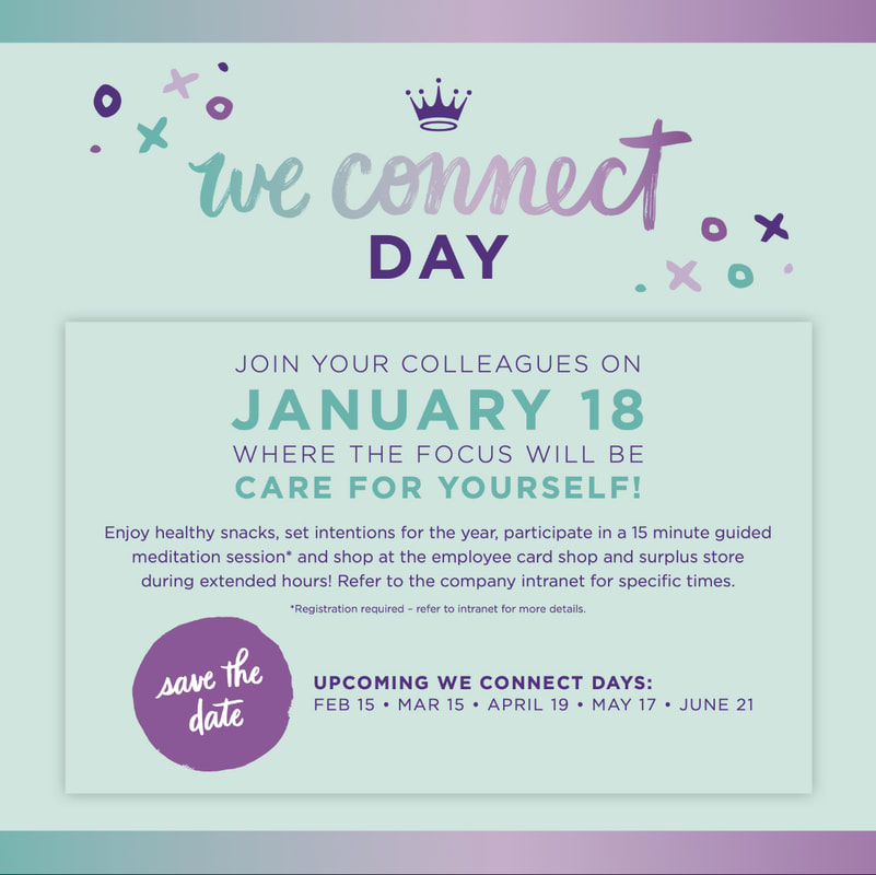
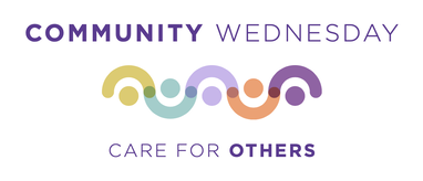
We Connect DaysIn an effort to improve culture in their new hybrid work model, the Employee Experience team decided to host monthly events for employees at their Kansas City Headquarters. These events needed a name, logo and overall look and feel that could be used month to month with little effort from the team.
This was a really fun project for us to work on as many members of our team have missed out on seeing co-workers in person since moving to the hybrid/remote model in 2020. We worked on a gathering in December for the holidays and wanted to continue with the sense of community many employees expressed feeling after the success of that event. |

|

|

|

|
|
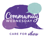
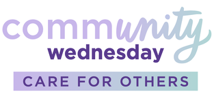
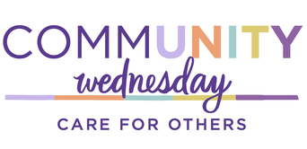
community wednesdays (alternative name)
|
|
|
|
|
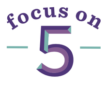
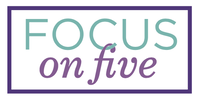
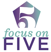
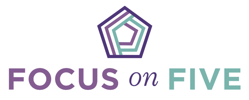
Focus on 5Focus on 5 is a new business initiative for Hallmark's staff In the field. This is to simplify their in-store tasks for days when they don't have much time. The goal is to make sure they are fully trained on these 5 things and can quickly accomplish them in store to better do their job.
I was tasked with creating a word mark that could be shared on training materials, and most importantly could be put on the screen of the device they use when in the field so they have easy access to their checklist while they're working in the stores. 
|

|
unselected word marks
|
|
|


|
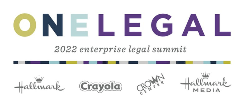
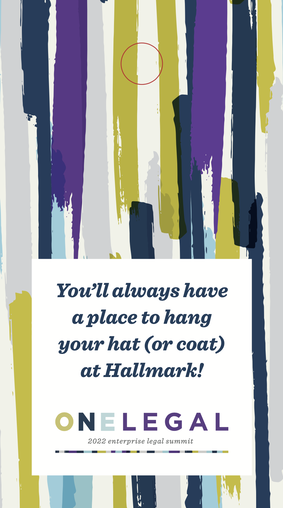
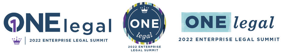
One Legal Summit Word mark
|
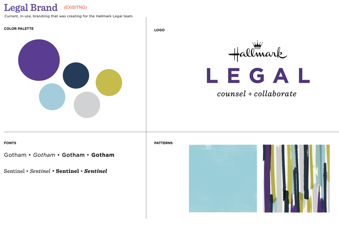
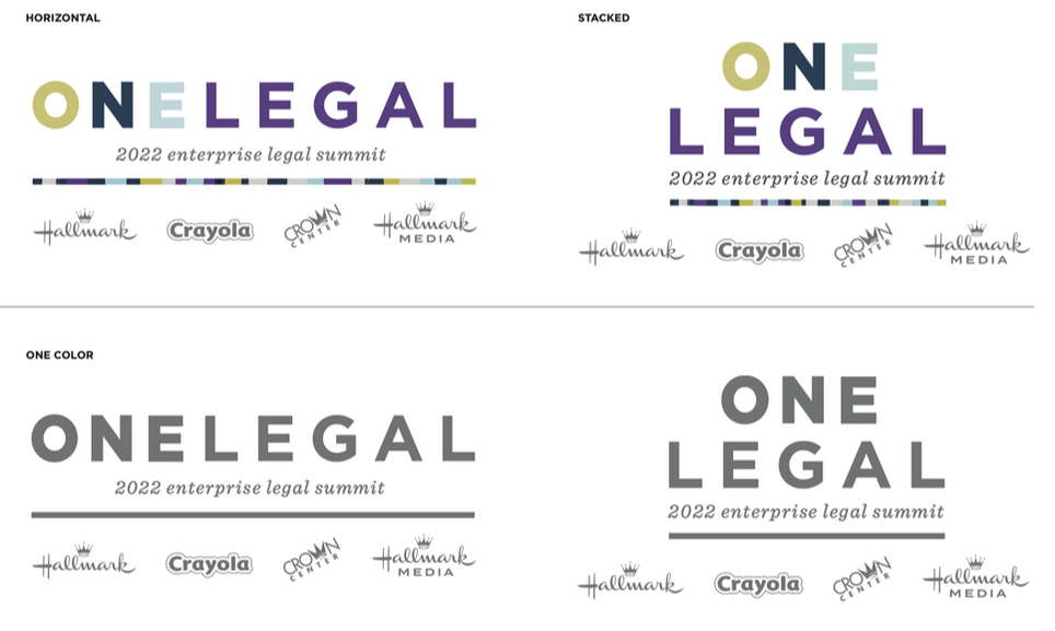
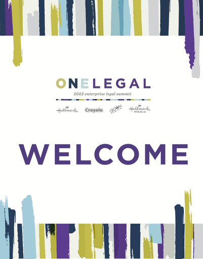
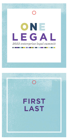
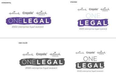
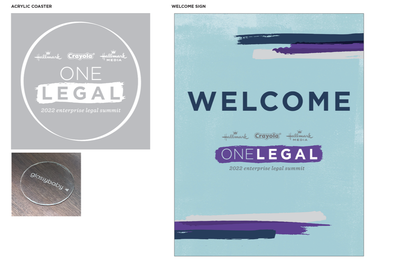
The Enterprise-wide Legal team at Hallmark gathered for a summit in person for the first time since 2019. I was tasked with taking their existing branding and creating a word mark for the event that tied into that brand, and creating tactics for the event.
One challenge of this project was to create a word mark and lock up featuring the many enterprise logos which needed to be applied to several tactics, including an acrylic coaster. This was a fun challenge that required a lot of problem solving. I worked with another designer on the team and our prototype studio to ensure the logo looked crisp on that application. |
|
|
|
|
|
|
unselected word marks
|
|
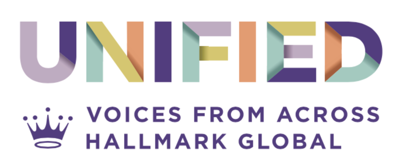
Unified WordmarkOne of my early projects as a member of this team was to create a word mark for a new speaker series featuring representatives from across Hallmark's global offices. The objective of this series was to highlight Hallmark's status as a unified global team, while promoting inclusivity in business decision-making and accountability for successes and setbacks across the organization.
I worked closely with my art director to develop a visually appealing and impactful word mark that captured the essence of the series' message. This involved experimenting with various design elements, such as typography, color palette, and layout, until we arrived at a final design that effectively communicated the desired message. The resulting word mark was used throughout the series, helping to build brand recognition and promote the idea of a global Hallmark team. |
|
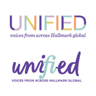
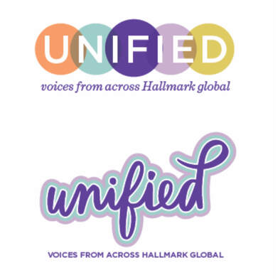
UNSELECTED WORD MARKS
|
|
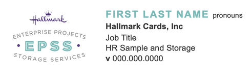
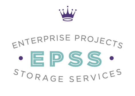
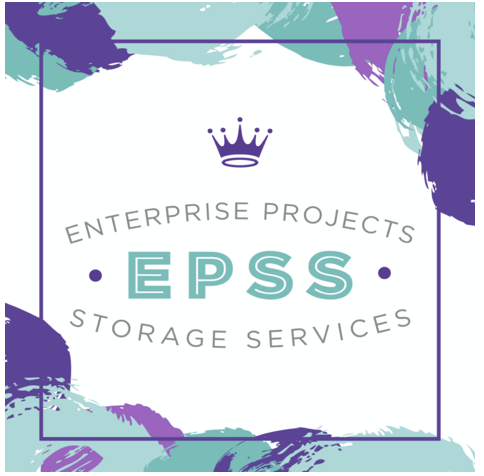
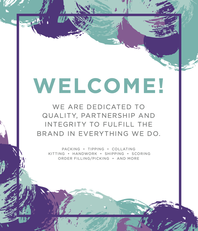
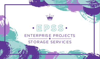
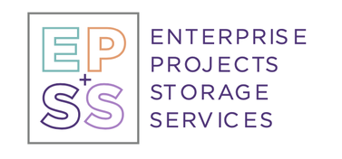
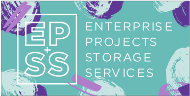
Enterprise Projects Storage services
|
Enterprise Projects Storage Services, was formerly known as the Sample department. They work on a variety of tasks for departments throughout the business. Their tasks include order packing, kitting, tipping, collating, handwork, scoring, and shipping. Since their name as Sample didn't fit their current level of work they changed their name and in order to showcase that change they wanted a new logo and an updated brand to replace their environmental graphics and directional signage.
|
|
|
|
|
Unselected word marks + example tactics

|
|
|
|
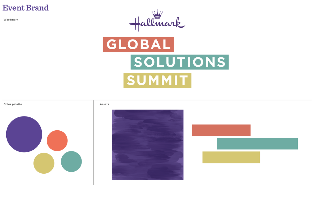
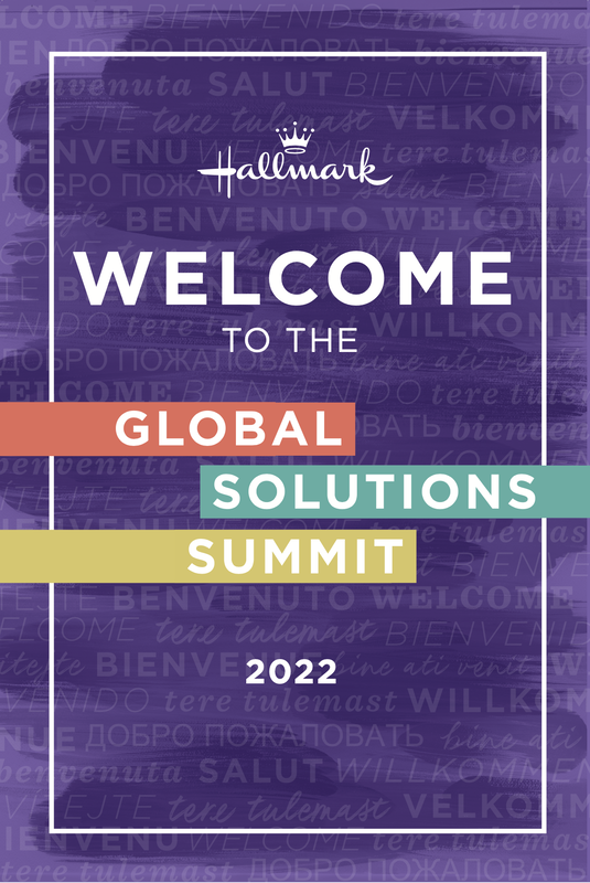
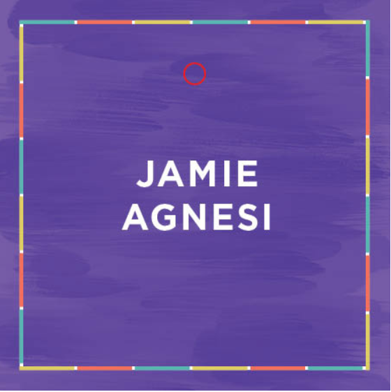
Global Solutions summit
|
I had the pleasure of working on an exciting project to create and implement a new brand for the Global Solutions Summit. As part of the Corporate team, I was tasked with giving the event a fresh and polished look, as it had not been held in person since 2017.
To start, I designed a dynamic word mark that featured bold color bars, strategically chosen to stand out against the signature Hallmark purple. I incorporated these eye-catching pops of color throughout the event to ensure easy recognition of signage for guests. The event was a tremendous success, with 40 retailers from 26 different countries attending at Hallmark Headquarters in Kansas City. It was a fantastic opportunity to showcase my skills and contribute to the success of such an important event. |

|
|
|

|
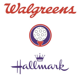
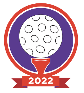
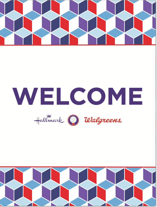
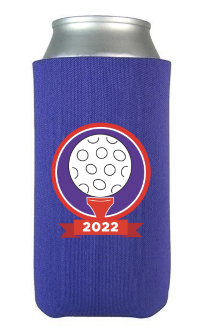
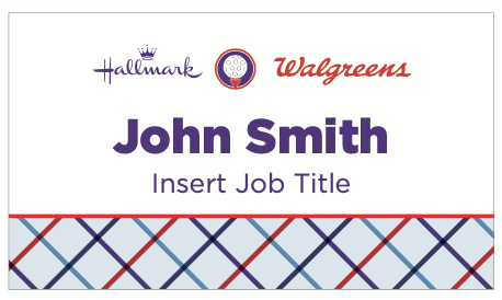
Walgreens golf classicFor this project, I was tasked with rebranding an existing event in partnership with a Senior Designer. Together, we developed a new logo lockup featuring a crest that showcased a golf ball sitting on a tee. This crest was incorporated into the event's centerpieces, which were die-cut and placed in grass arrangements. We also used this crest on swag given to attendees, including can coozies. To ensure consistency year-over-year, we created a simplified version of the logo lockup for future use.
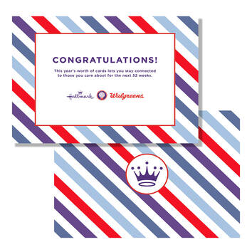
Additionally, I created new patterns for the event. The previous versions had used plaid patterns, so I aimed to create something fresh and modern. To accomplish this, I utilized the modern block pattern, paired with stripe and windowpane patterns to maintain the preppy feel the event was going for. Overall, this was a successful rebranding project that effectively distinguished the event from its previous iterations. |
|

|
|
|

|
|
Sustained Juice KCThe Sustained Juice KC logo has undergone a significant revamp to better embody the essence of juice. The original logo primarily emphasized the word "sustained" without visually representing the core concept of juice. In the redesigned logo, we placed a strong emphasis on showcasing juice as the central element.
To capture the natural and organic aspect of the business, we incorporated a vibrant green color into the logo. This shade not only symbolizes the freshness and wholesomeness of the juices but also aligns with the sustainable practices followed by the company. By infusing the logo with this green hue, we aimed to create a visual representation of Sustained Juice KC's commitment to providing natural and organic products. |
|
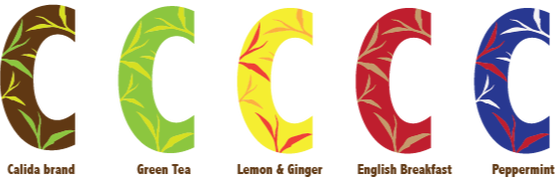
Calida TeaCalida, a renowned global tea brand, is placing a strong emphasis on the comforting and warming aspects of tea. The designs we have created revolve around showcasing the diverse varieties of tea and their unique effects on the body, mind, and soul.
With a target audience of younger tea drinkers and health-conscious consumers, Calida aims to capture their attention and resonate with their preferences. Each design within the collection focuses on a specific tea variety, highlighting its distinctive benefits and characteristics. By presenting the range of teas and their associated effects, we aim to engage and educate consumers about the diverse offerings and wellness properties of Calida's products. While the brand pattern remains consistent throughout, we have introduced a color scheme that varies for each tea variety. This deliberate choice allows consumers to easily recognize their favorite flavors at a glance, enhancing their overall tea-drinking experience. The colors chosen for each tea reflect their unique qualities and attributes, creating a visual association that complements the taste and experience of each tea blend. By focusing on the warming nature of tea, highlighting the tea varieties and their effects, and implementing a color-coded system, Calida positions itself as a brand that caters to the preferences of a younger, health-conscious audience. These thoughtfully designed elements contribute to a cohesive and visually appealing brand experience that connects with consumers on both a sensory and emotional level. |


|
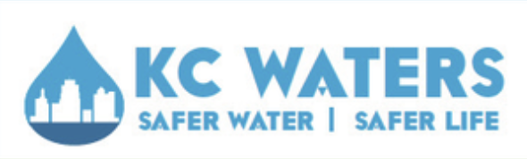
KC WatersAs part of a collaborative team of four, we undertook the exciting task of completely redesigning the website and app for Kansas City Waters, along with creating a comprehensive ad campaign to promote their app, KCWaterBug. Our goal was to enhance the user experience and increase app downloads.
Throughout the project, we applied our collective expertise and skills to craft a fresh and user-friendly design for the website and app interface. We focused on creating an intuitive and visually appealing user journey, ensuring that users could easily access the information they needed and engage with the app's features seamlessly. After completing the redesign and campaign development, we had the opportunity to present our concept alongside two other groups. Our hard work, attention to detail, and innovative ideas resonated with the decision-makers, and our designs were selected as the winning choice. Being chosen as the preferred design further validated our efforts and affirmed the quality and effectiveness of our work. It was a rewarding experience to see our collaborative efforts come to fruition and contribute to the success of Kansas City Waters in promoting their app and enhancing the user experience for their audience. |
|